Group work by Cheuk Hei, Chin Lui, Jianhao, Qing, Sze Yin Melody, and Ziyi
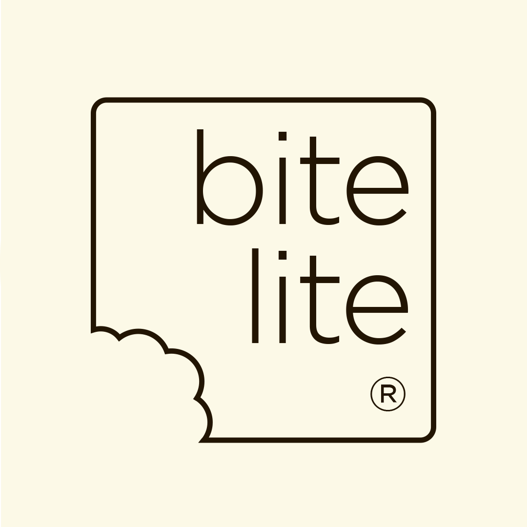
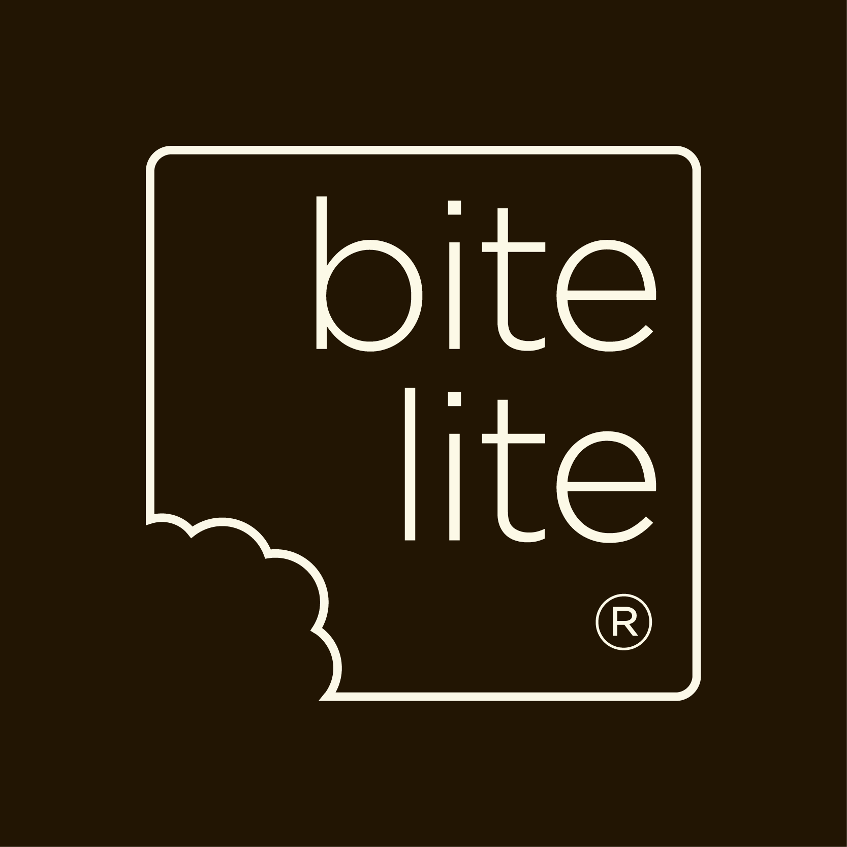
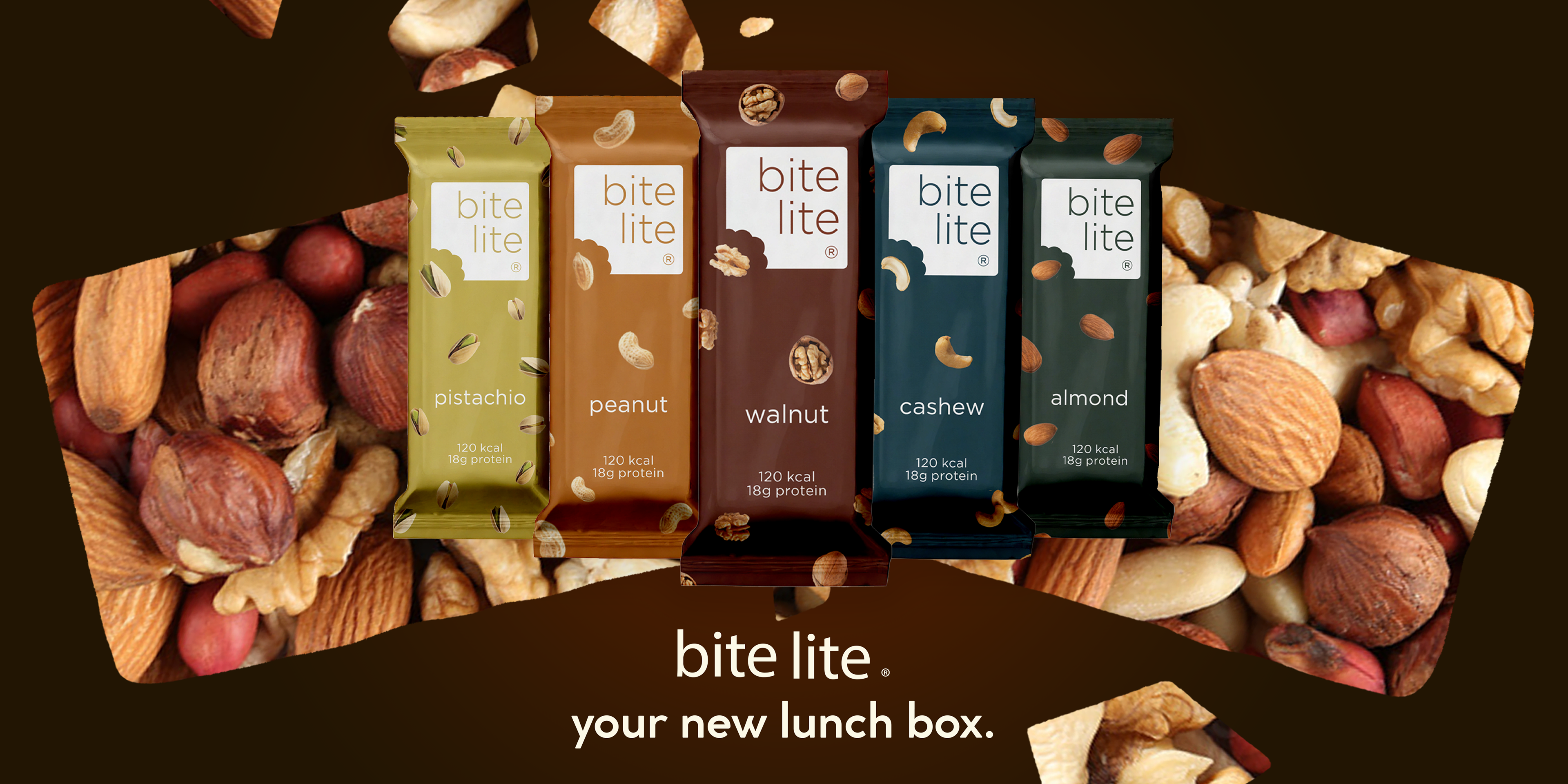
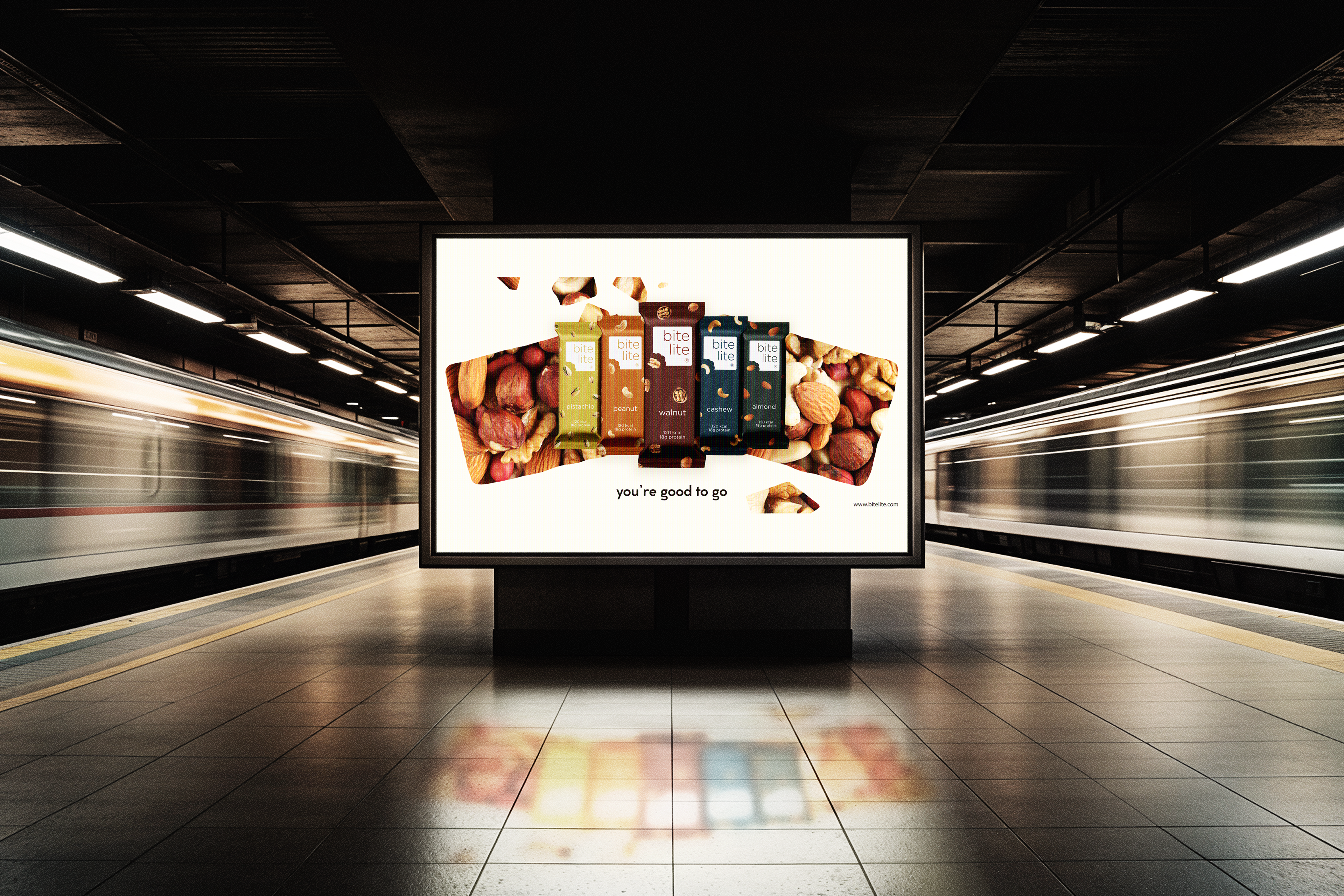
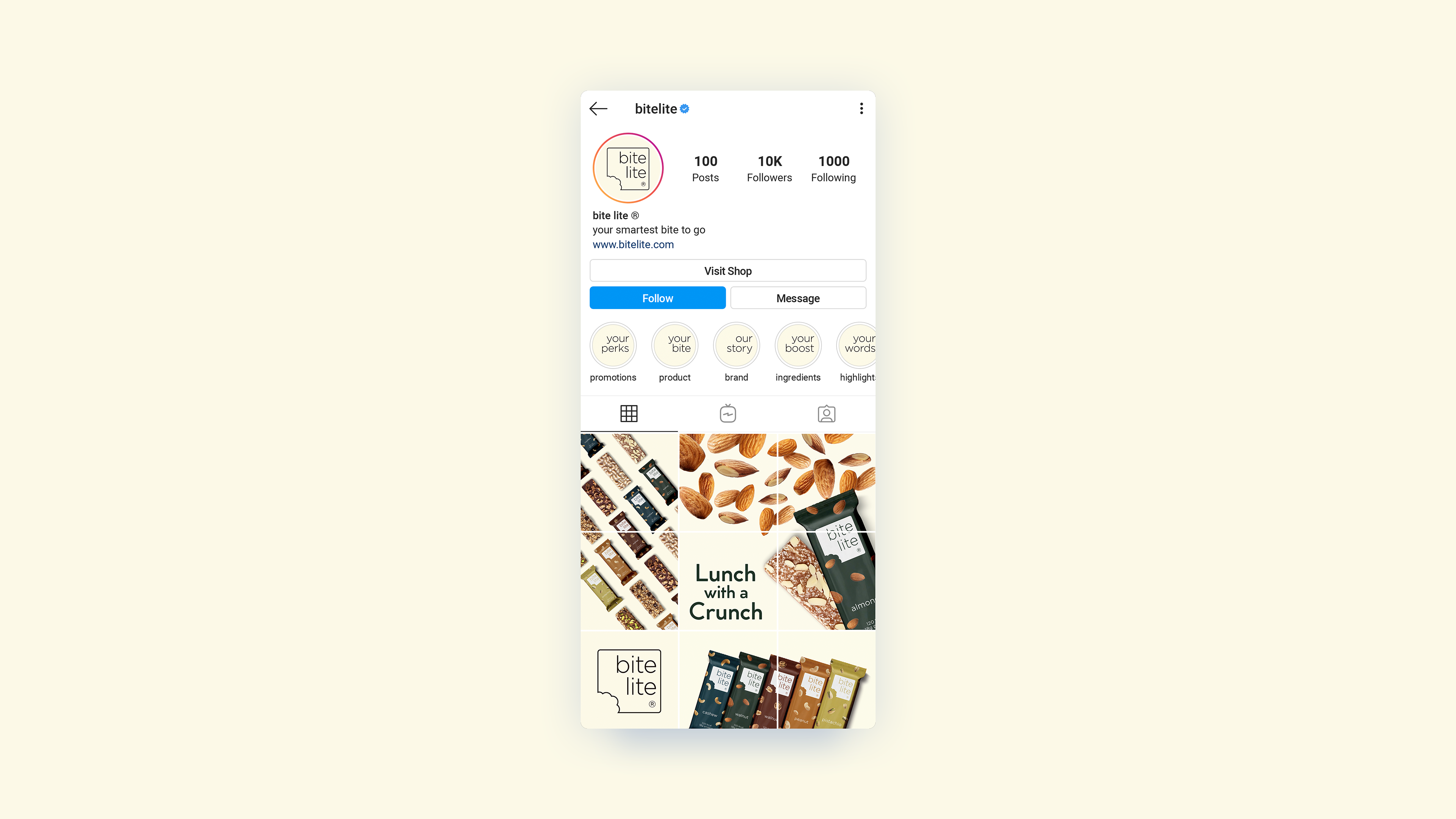
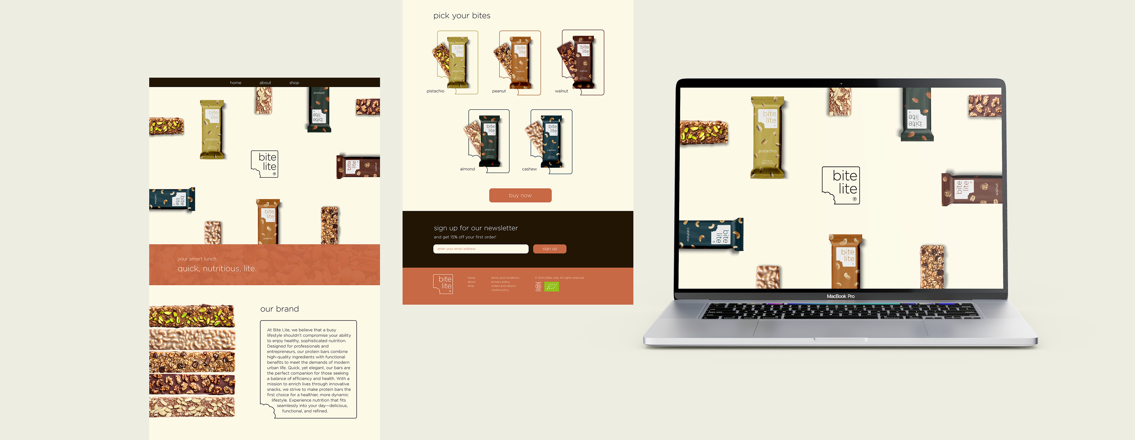
The Bite Lite logo features a rounded-corner square with the bottom left corner “bitten,” symbolising a quick, convenient snack that’s ready to grab and enjoy. The typography used is Gotham Light Regular, chosen for its thin, clean lines that convey our brand's “lite” aspect, highlighting the low-calorie, healthy nature of our protein bars. The brand name is aligned to the left, creating a balanced, modern look that reinforces the sense of ease and sophistication in our products.